BEFORE & AFTER: MY BRIGHT + BOLD HOME OFFICE REDESIGN
/Experiencing the power of a good makeover always blows my mind...even though I make this kind of magic happen for a living. There's something about seeing an unfinished space, creating a plan in your mind & then watching it come together--bit by bit--that will never get old for me. Never.
So I was glad when the time finally came to wave my magic wand around my home office. The truth? This space has been unpresentable for years (like, since I first moved in). I started off in the smaller of my 2 guest bedrooms then eventually migrated to the larger room. But like much of the rest of my house, it took me awhile to figure out what I really wanted...how I would work in the space, what kind of storage I needed and time to sort through all of the junk that I somehow accumulated & collected over the years. Ugh.
So when I was approached earlier this year to be a spokesperson forAstrobrights'"Colorize Your Business" campaign, the timing lined up perfectly. I'd already crafted my design game plan in anticipation of my office redo and since part of my duties involved filming a few videos for Astrobrights' campaign, my newly designed office made for the perfect backdrop.
So the Befores....
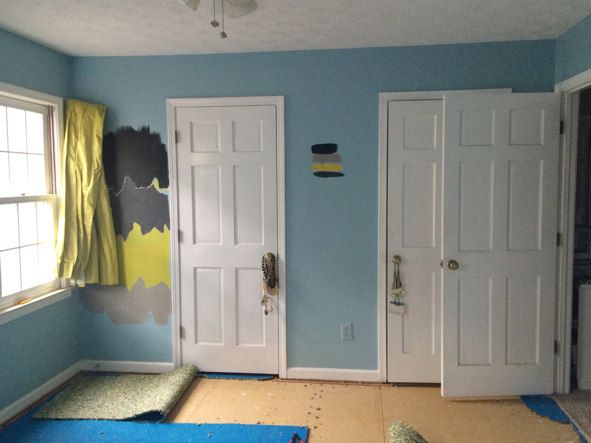
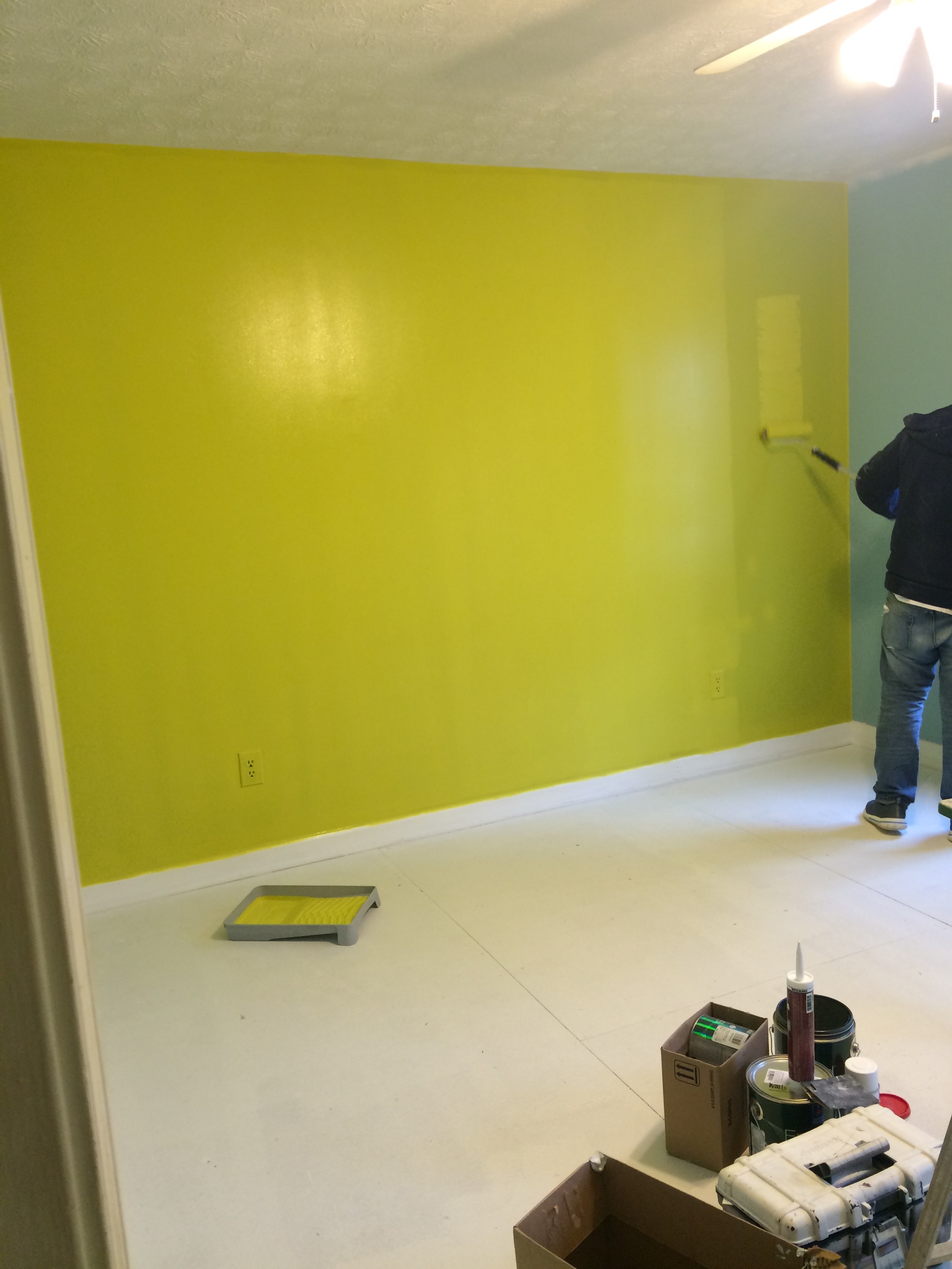
It didn't look exactly like this in the beginning--this is actually an in progress shot once I started clearing everything out but as you can see, there's not much to see here. The energy radiates off of this room...and it ain't good. I actually liked the orientation of the room as I originally had it (I had 5 Ikea Vittsjo shelves behind the desk which worked really well to anchor the space) but nothing else was working...as you can gather.
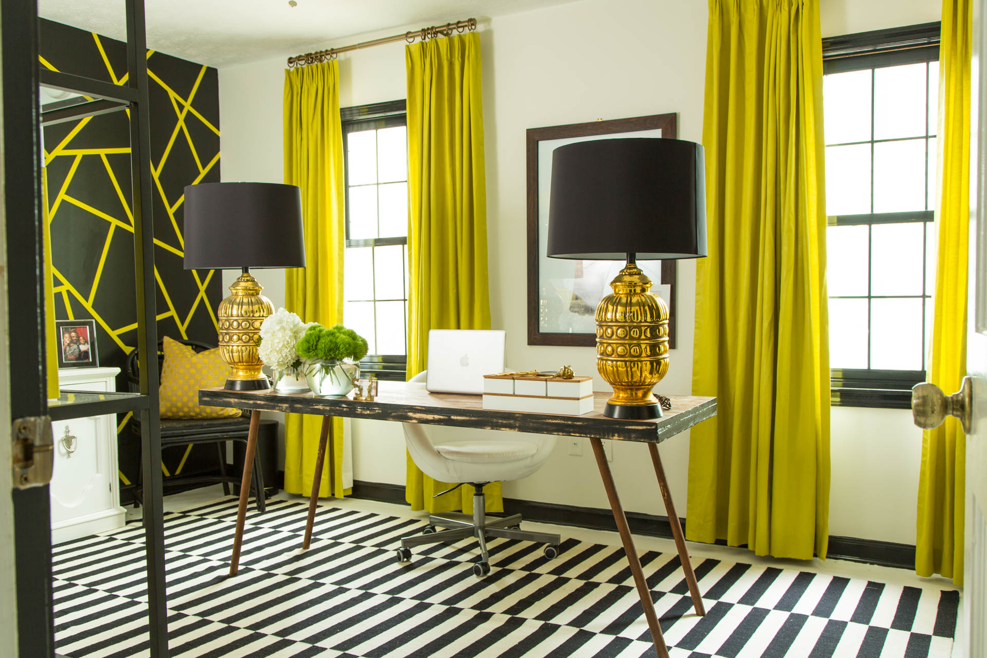
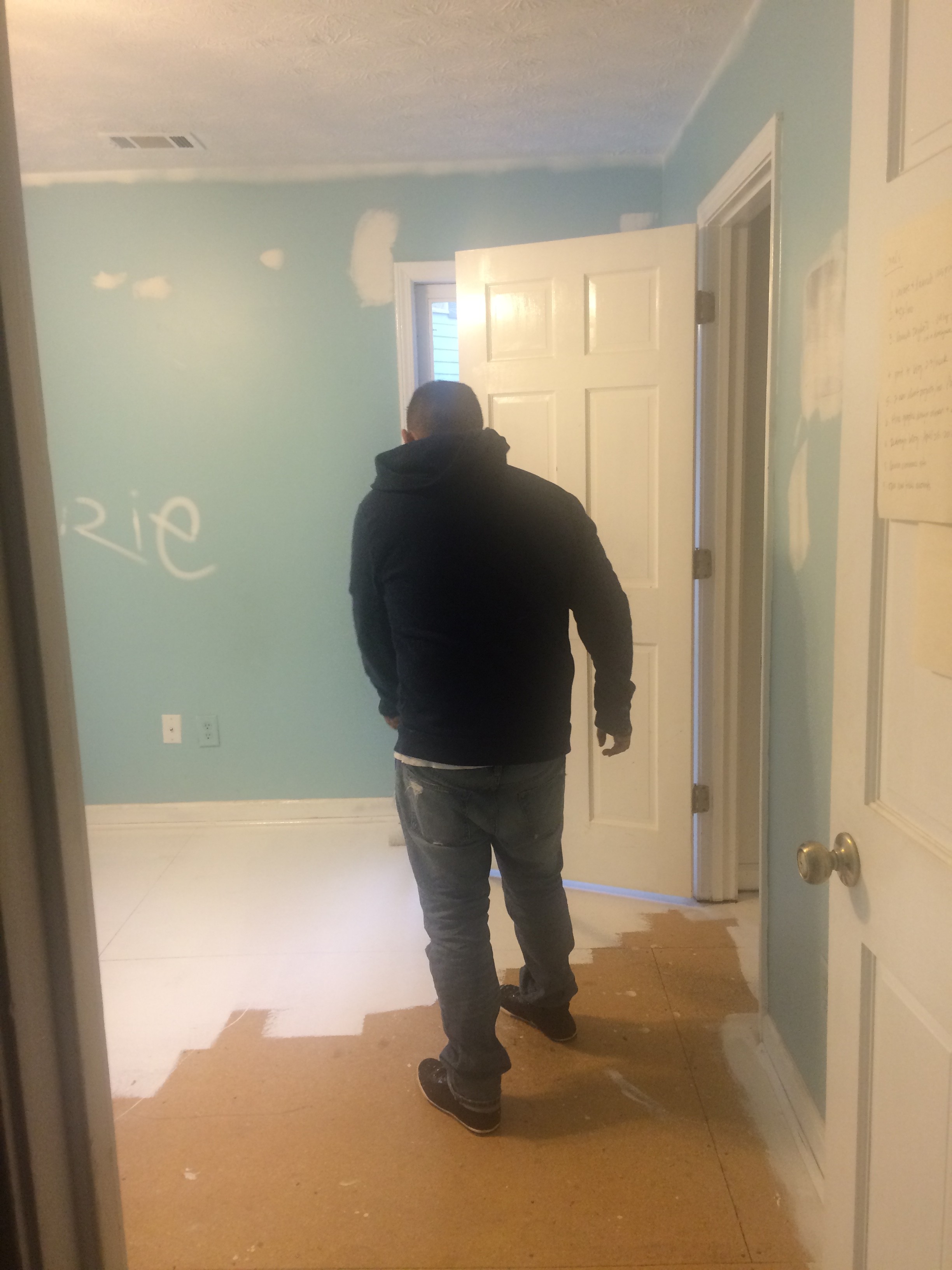
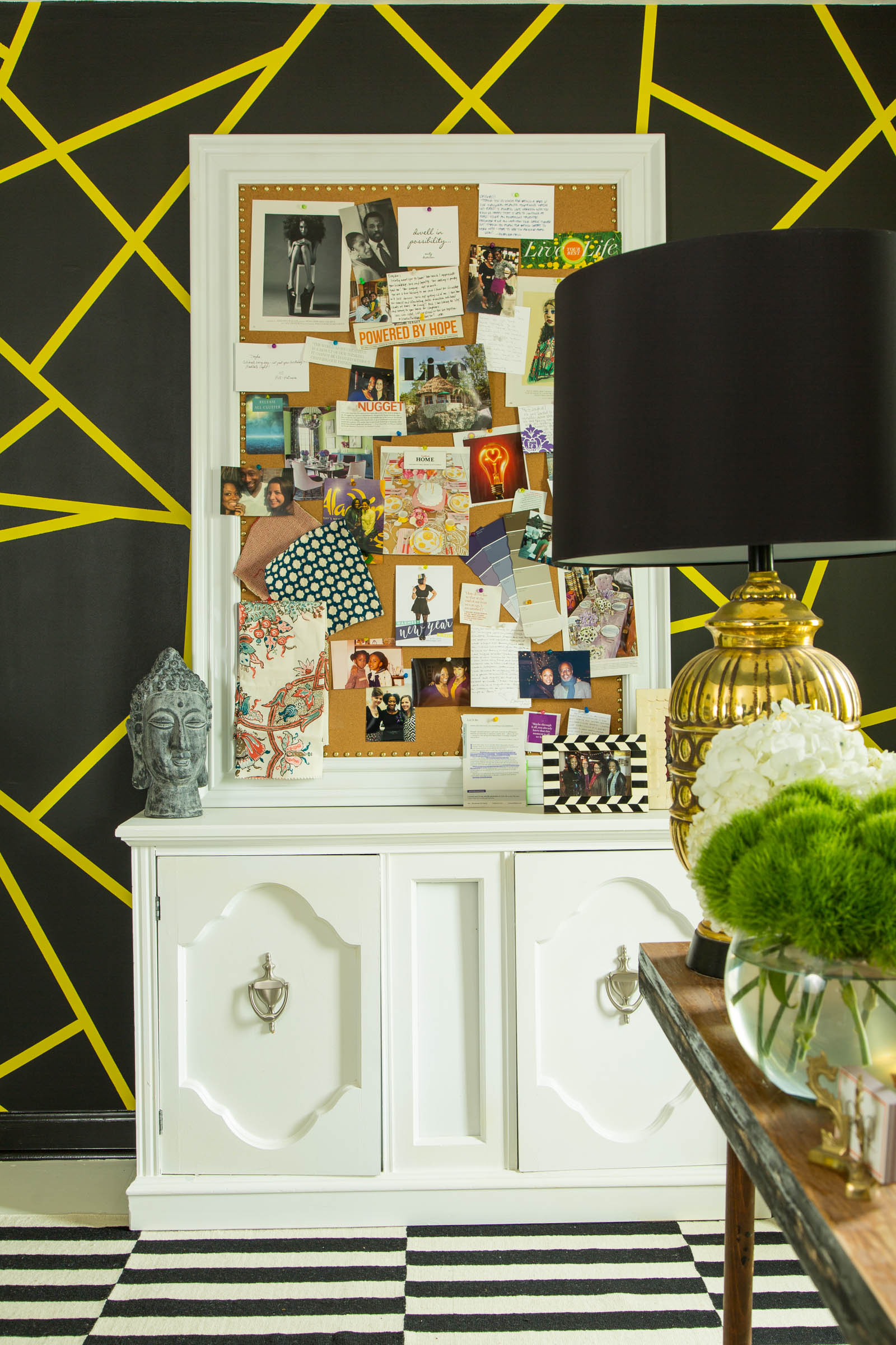
Once I started pulling up the carpet (my new white floor is actually just the original subfloor painted white with an industrial strength Sherwin Williams paint) it started to look like something I could really work with. And this is the phase of design I love--the scary part where it gets worse before it gets better. You may even recognize the paint on the wall next to the closet door--when I participated in the 2013 Cathedral Antiques Inspiration House, I just couldn't wrap my head around what I'd planned without seeing it in person, so I tested out the design on the walls of my home office. Needless to say, after playing around with the color variation, the design made the cut. And the rest of the Afters:
(painted the door jamb Chartreuse as well as the closets!)
The best thing about my new space? Not only does it feel like me, but I work SO much more efficiently here now that I've decluttered, reorganized and created a proper place for everything I need. It reminds me that there's not just an aesthetic value to interior design but an intrinsic one as well--and that your space is often times a reflection of your life.
I love that I'm in a place where everything on the inside is being reflected in my home--organization, expansion, renovation & completion.Just like me.

